
Tuesday 29 April 2014
Wednesday 2 April 2014
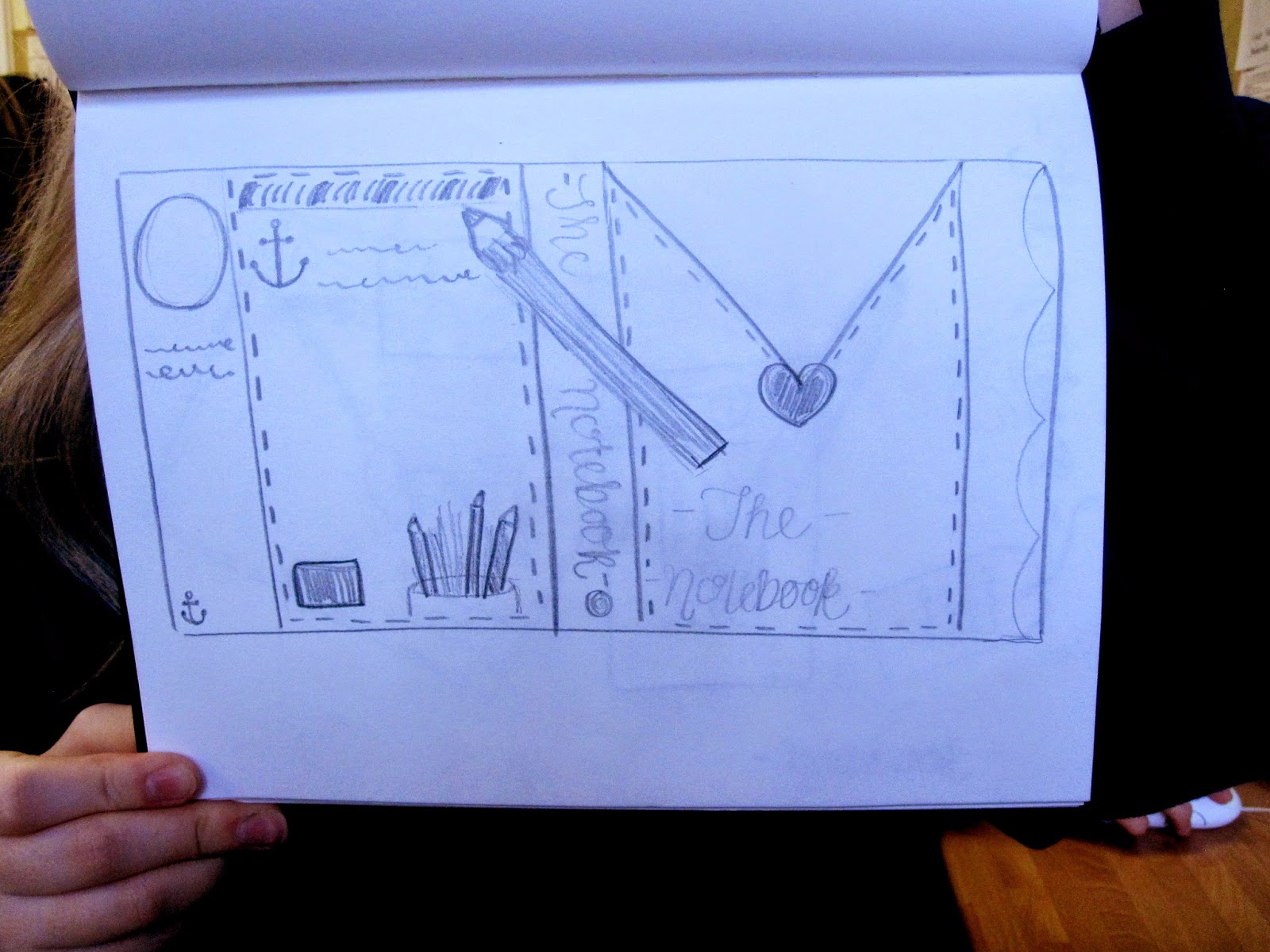
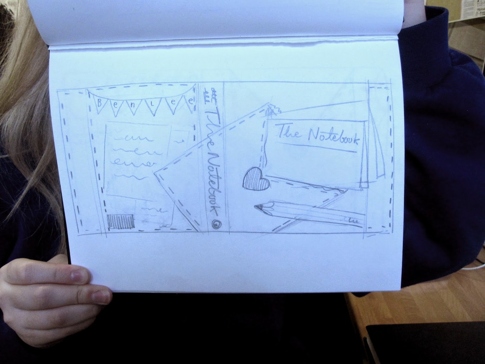
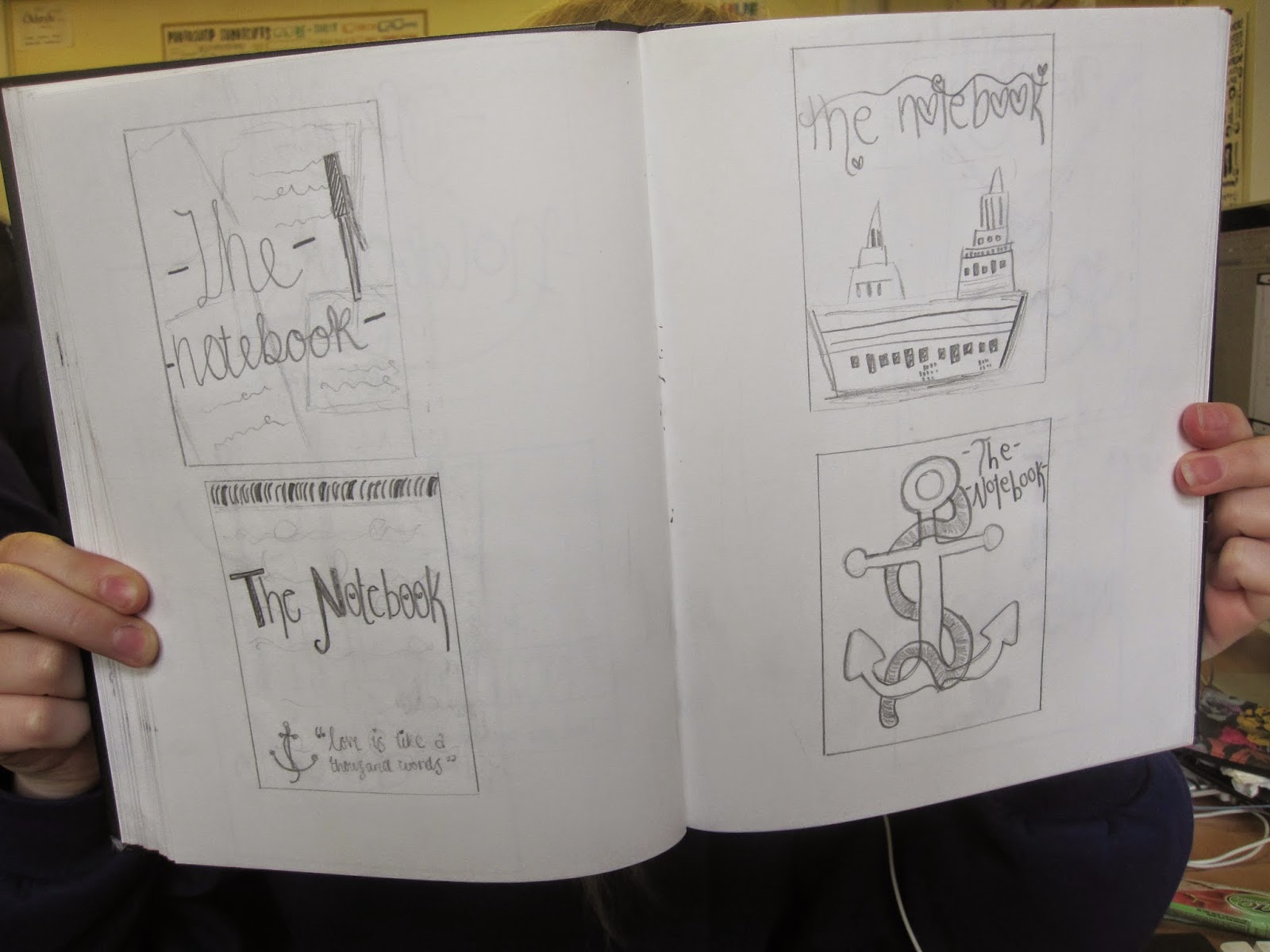
Work in progress

Firstly i added in an image from the internet of old worn away paper for my background throughout the book. Then i inserted the chosen type face i thought was suitable for my book.

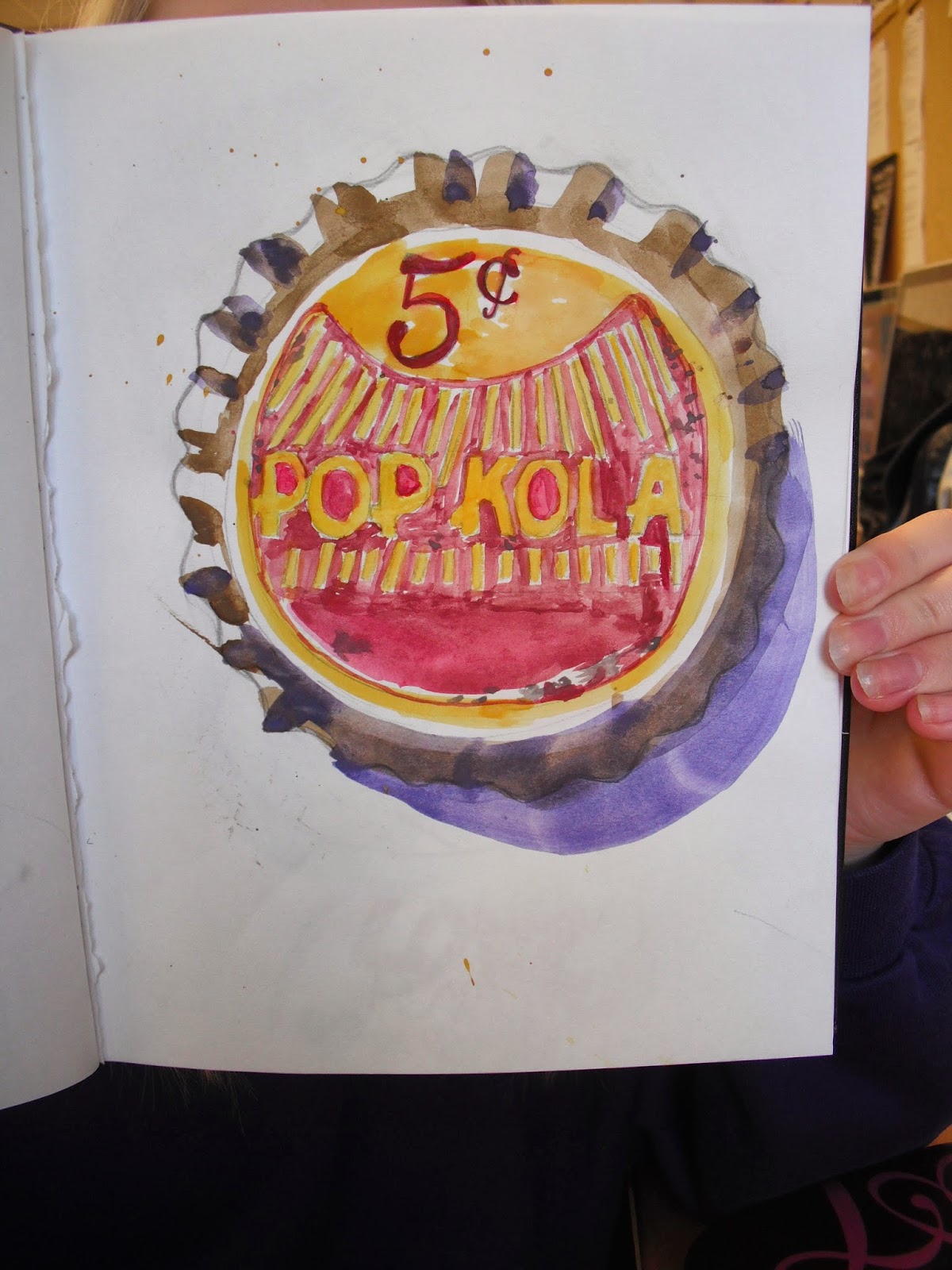
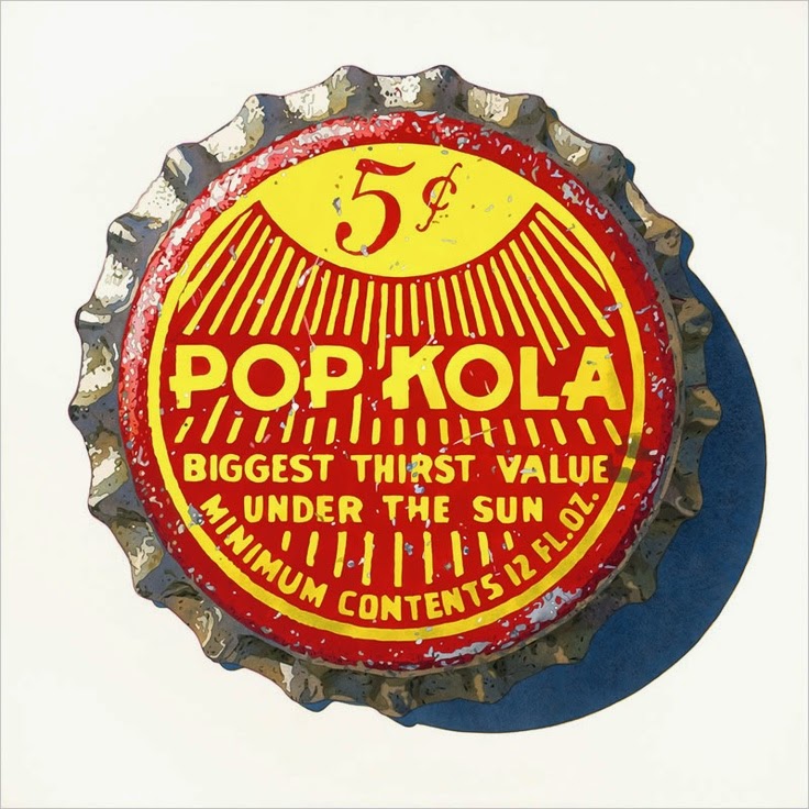
Secondly i edited one of my photos in photoshop. I adapted to colour balance and added in an light flare into the image to add light. I used soft yellow and orange colours as the image on the right helped me to develop this colour scheme.
I then added in old text over the top. I found this image off am old postcard. I changed the opacity and faded it out slightly by using the gradient tool.

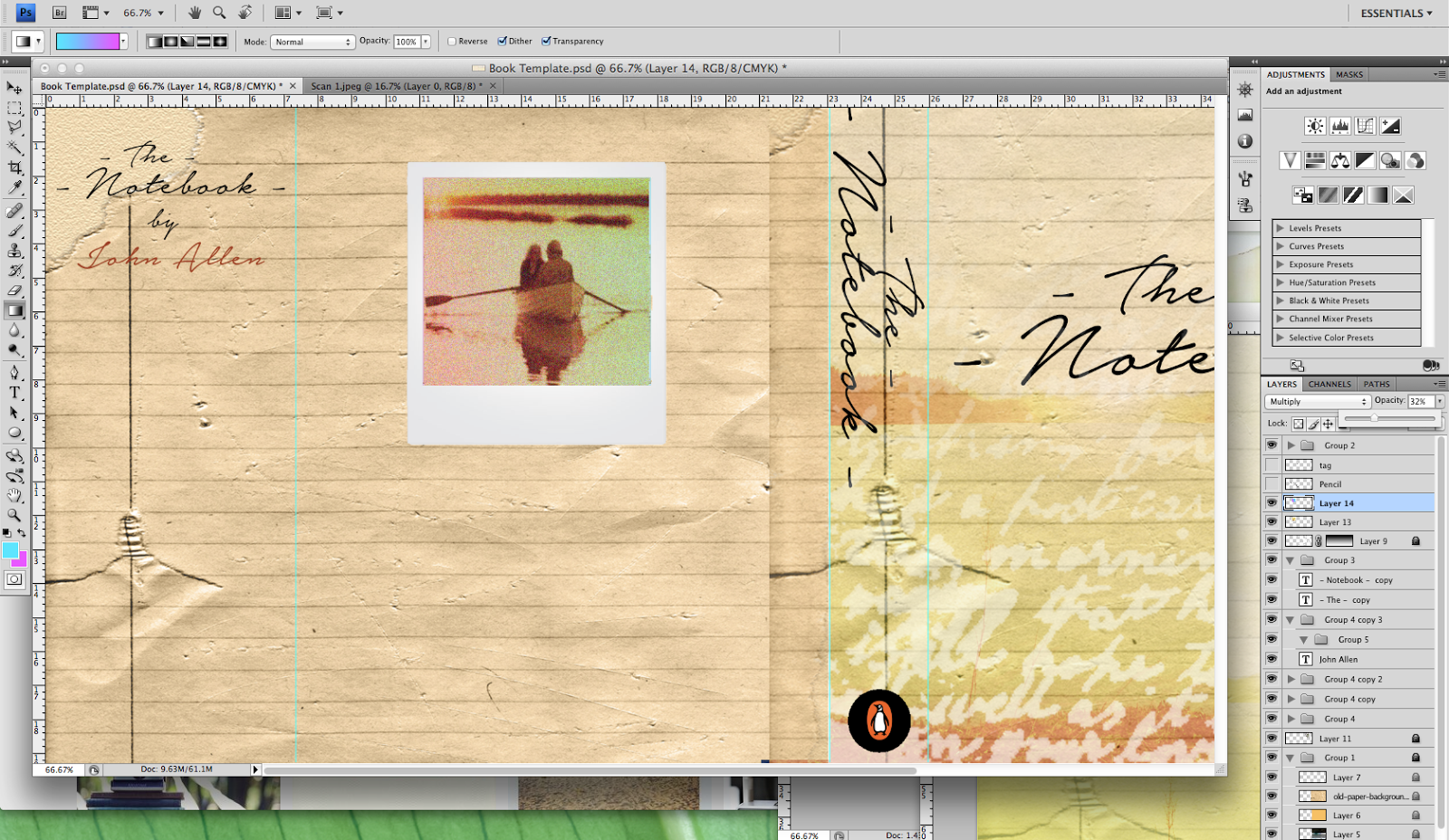
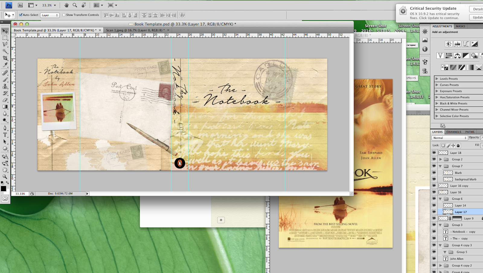
For the back page i then added in old postcards, tags and a pencil to fill up the white space that was present. I lowered the opacity to fade them out. I also added ink splashes onto the background to add the effect of someone writing in the olden days.

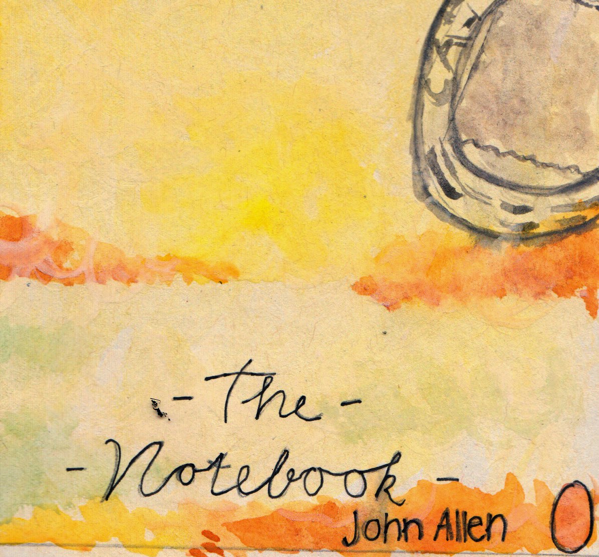
Finally, i added in a old stamp to my front cover to carry on the theme. I also moved the title to the bottom of the page to ensure you could see the image in the background. On the left flap i added in a tag and added text. I added in the barcode, publisher, price and website as these are important features when creating a book. I added more than one type face into the book to make the book more visually interesting and not boring. The authors name and review are both in a sans serif type face.
Sunday 30 March 2014

Tuesday 25 March 2014
Monday 24 March 2014
Monday 17 March 2014
Digital Type


These are just some of my digital type choices i think would be perfect for my book cover.
Friday 14 March 2014


Subscribe to:
Posts (Atom)